
A subsidiary company from Dyandra engage in property ( Griya = House), the name of this company (PT) already determined before.
Website: –
Client Since (Year): 2011
Scope of Projects: Branding (Brand Identity Development)
Top brand visual & communication agency, based in Jakarta, Indonesia. Experienced 7 years+. Graphic design services for corporate and personal. Affordable!
A subsidiary company from Dyandra engage in property ( Griya = House), the name of this company (PT) already determined before.
Website: –
Client Since (Year): 2011
Scope of Projects: Branding (Brand Identity Development)
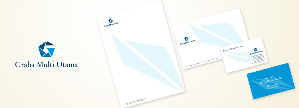
A subsidiary company from Dyandra engage in property ( Graha = House), the name of this company (PT) already determined before.
Website: –
Client Since (Year): 2011
Scope of Projects: Branding (Corporate Identity Development)

A small salon and bridal house started at the location of the home owner. This project also includes the selection of the name “Griya Beautiful ‘, instead of’ salon ‘for services offered here are not only limited to regular treatments available in the salon in general, but includes also other beauty treatments with traditional approaches and also comforts like our own house (“Griya” has the meaning of ‘home’). Currently Griya Cantik Dyla already opened branches in other locations and become a brand that is increasingly exist. The logo symbolizes the letter D which is the initial of “Dyla”. Arch letter D also represents a form of leaves that have elements of nature / natural (because the treatment provided in this place mostly use traditional medicines). Ornaments measure also strengthens the traditional sense but in appearance, the scratches were made also displays a minimalist and modern impression. Inspired by the shape of the bridal headband which is rotated 90 degrees, a carving at the top of the headband deliberately made with classic look without bring out certain custom (such as Java ornament / Sunda / Minang / other regions).”Griya Cantik” is a term given to Dyla as a beauty center specially for women, either for the women who want to have beautiful look and perfect in their special day, even for the women who in their daily activity wants to always take care of themselves in natural way and natural traditional herb. Dyla realize that every woman is essentially beautiful, it is only a matter on how to developed it to become “one step more beautiful”, in accordance with the chosen tagline.
Website: –
Client Since (Year): 2010
Scope of Projects: Branding (Brand Identity Development)
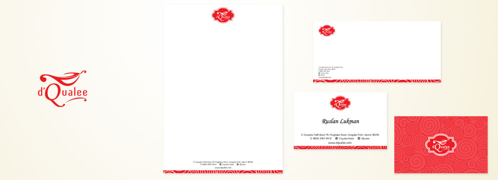
Starting from the idea of making a small shop with modern minimalist nuanced that sells variety of high quality food at affordable prices, creates the name of “D’qualee” which is sound like Italian, where the food served in this shop are specializes in the form of Italian food, namely pasta and the like. Although not rule out other foods are also offered here. “Qualee” which reads “cauldron”, can be interpreted simply as a place to cook a variety of foods; as in Italian “quale” which means the call for “What’s that?”, implies a mysterious signifcance that invite people to taste what delicacies in this shop is like and wondered the secret behind the success and delicacy of this shop. D’qualee want to be accepted as a brand that seemed luxurious, yet affordable. This tavern (a can also be referred to as a mini cafe) showing the identity of modern, eye-catching of a little display of oriental ornament, combined with red color that makes this brand so different and superior. The tagline “qualee-ty food with affordable price” is an overall reflection of this brand that displayed in a sentence.
Website: www.dqualee.com
Client Since (Year): 2014
Scope of Projects: Branding (Brand Identity Development), Stationery Production, Packaging Design, Brochure (design & production), Roll-up Banner (design & production), Cutter Sticker for Interior (design & production)

The biggest Convention Center in Bali in BTDC are, Nusa Dua, managed by Dyandra. This BNDCC logo inspired from Brahma God who have plenty hands as symbol of creator god, as a whole BNDCC logos has a typical Balinese flower form, and also it has seven flower casing which is the favourite number of Dyandra Group owner. Gold colour also symbolize luxury and prestige of the brand.
Website: www.baliconventioncenter.com
Client Since (Year): 2010
Scope of Projects: Branding (Brand Identity Development), Website Development, Booklet/ Brochure as Company Profile Development (design & production), Folder (design & production), Exclusive Calendar (design & printing), Season’s Greetings Card (design & production)

Client: Archipelago Arena
Website: –
Overview: A brand for the biggest venue planned to be build in Senayan (utilize a partial land of Gelora Bung Karno), manage by Dyandra. Form of designed building architecture is very modern and futuristic that the logo will be used later must accommodate the form of the building itself.
Client Since (Year): 2008
Scope of Projects: Branding (Corporate Identity Development)
Every single person affiliated in éarly share one thing in common: they believe this one extraordinarily inspiring quote by anonymous: “Whatever we do, we eat-sleep-and dream with it".
- Meiliana, founder